Saturday 30 April 2011

Project 2 - FINAL


Particle Waves


In order to create my final product, I utilized what to me seemed most important for my program from the http://www.openprocessing.org/visuals/?visualID=17191 physics. The mouse attraction. Since I wanted my design to be focused on the visuals/intuitive mouse interaction I decided this would be the best part to emphasise. For sound I wanted something subtle that would complement the forms being created by the mouse/particles rather than something which would become it's own interaction altogether. After experimenting with sine waves which would change depending on how the user handled the mouse, I decided a better way to go would be to use a sound which evoked the visuals. I chose several different clips of the sound of waves, which play slightly differently depending on where the user releases the mouse.

Project 2


Interaction test.

After playing around with some basic mouse interaction code I decided that I wanted to create something that was heavily user interaction based and able to be influenced in a very natural, intuitive way. I did not want a program which would define the way the user chose to use it, instead I wanted something which had a degree of flexibility and which was above all else, actually fun to use.

In the end I decided to use http://www.openprocessing.org/visuals/?visualID=17191 as a base for my code, as I liked the idea of separate particles and being able to manipulate them with the mouse as well as the simulation of physics.

Thursday 14 April 2011

Project 2 - Inspiration


Spring Mesh


-


Attract2D


-

These two processing sketches both appealed to me due to the mouse interaction and the way they emulate stress/tension. Although as a user we cannot 'feel' through the mouse, the sketches here I felt managed to simulate the effect. I noticed that both of these sketches used toxiclibs libraries and so affected my decision to also use those libraries in my project.


Monday 21 March 2011

Wallpaper FINALS

My final set of wallpapers for DSDN142 Project 1

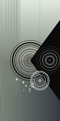
I decided in the end to stick with a simple, unobtrusive colour theme and tried to base my composition structurally with some degree of symmetry. Each circle in the panel is different, based on randomly generated numbers and varying transparencies/fills.


Panel 4
http://www.openprocessing.org/visuals/?visualID=24421


Wallpaper Inspiration

My original inspiration for the wallpaper was from artwork I found. I wanted to break away from the repetitive PatternMaker code we had been previously using, and create something a little more abstract. However I desired to keep to simple geometric forms.


I liked the combination of vibrant gradient colour contrasting with the black background. Despite being made of repeating circles, it is still very eye catching to me.


Monochromatic gradient. Minimalistic and beautiful.


Probably my greatest influence. I liked the subtle colours/gradient + addition of variations on a repeating element, i.e circles.

Thursday 10 March 2011

Wallpaper Sketches

Sketches for a set of four wallpapers. I wanted something which would join all four panels as a whole.


Monday 7 March 2011

DSDN142 Week One PatternMaker Exercises

Using Ben Jack's PatternMaker our first assignment was to produce a range of sketches and post four -


The most beautiful,


The most interesting,


The fanciest,


and a clearly specified one based on our lecture hand sketches.


Deciding which categories these particularly fitted into was a bit of a moot point, as beauty and interest are entirely subjective...


I liked this one for the monochromatic colour scheme and simply for the cleanness of it
Fairly simple coding of course, just learning to use bezier curves.


If I learnt anything from making this sketch, it is that 'impossible triangles' are named so for a reason. On a more technical side, I feel positive that there could have been a simpler way to go about achieving this as I spent a long time simply having to estimate where to put coordinates.


There's nothing fancy about these (very simple) lines. I really liked this one however and selected it as the 'fanciest' because of how the lines affect each other e.g the almost 3D look at the edges.


And lastly, a 'clearly specified' pattern based on a lecture sketch. To be perfectly honest I wasn't entirely sure where I was supposed to be going with this. But it has taught me that perhaps translating ideas from paper to computer is an area to work on!